Product Rebrand Website
A product rebranding website for the Tingg brand that uses colour and design to communicate to Consumers, Businesses and Developers
A product rebranding website for the Tingg brand that uses colour and design to communicate to Consumers, Businesses and Developers
Role:
Team:
Tools:
Duration:
UX Designer
Elizabeth Akpan, Ariyike Adetimehin
Adobe Suite, Questionnaires
1 week
Cellulant is the gateway to online and mobile payments in Africa. With operations in over 11 countries, Cellulant is a leading Pan-African digital payments service provider that offers numerous products and services to businesses, banks, and end consumers.
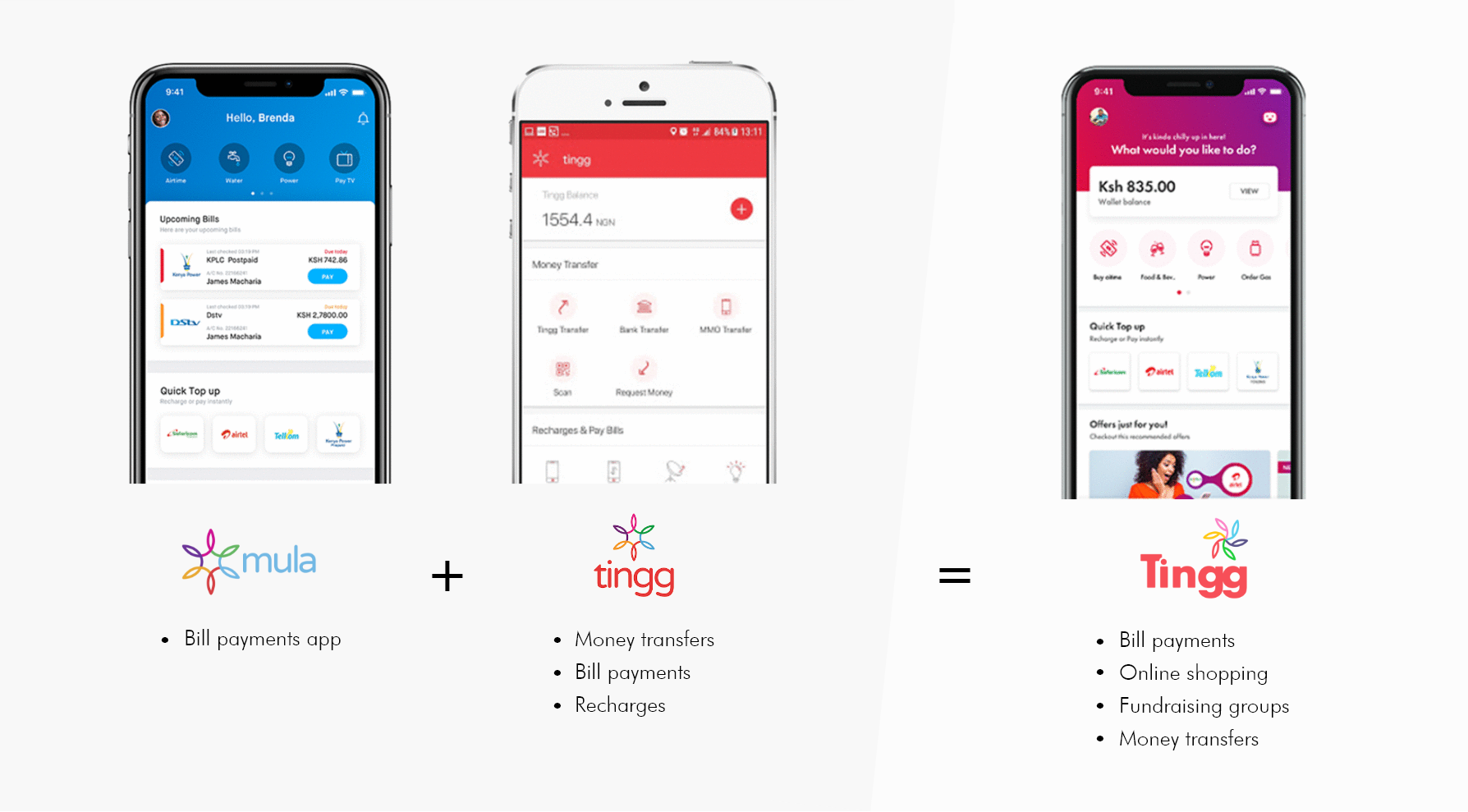
Currently, Cellulant interacts with its consumers through various channels and brand names which are not completely connected leading to loss of value. Since both Cellulant's consumer facing products, Mula and Tingg, offered similar propositions to customers and businesses, a decision was made to converge the two products into a single brand that can scale across Africa. This new brand would maintain the name Tingg.
I worked remotely in a team of 3 on this one week assignment to design an informational website for the new Tingg brand. Our goal, as instructed by our direct manager, was to “design a 5-page website that represents the Tingg brand and uses colour and design to communicate to our Consumers, Businesses and Developers” .
The process to complete this project was a 4 step one:

Understanding the product, i.e. the Tingg brand, was a crucial first step in knowing how to design a website that highlights its features and benefits to different audience groups. The key points we sought to understand in this phase therefore included:
We conducted 2 forms of research in order to find out this information
This was mostly obtained from already compiled Cellulant data which was shared upon request.
obtained from internet searches to supplement data from the primary research. This involved looking at existing customer reviews from platforms like Google Playstore.
Our design choices were heavily influenced by our research findings and the Tingg brand guide. The sub phases included in ideation were:
Our research findings led to the creation of the following website requirements:
The structure for the website was decided after carefully examining the brief, the data available and best practice for user experience and interface design. We began with a brainstorm of both the site map and content map as seen below.
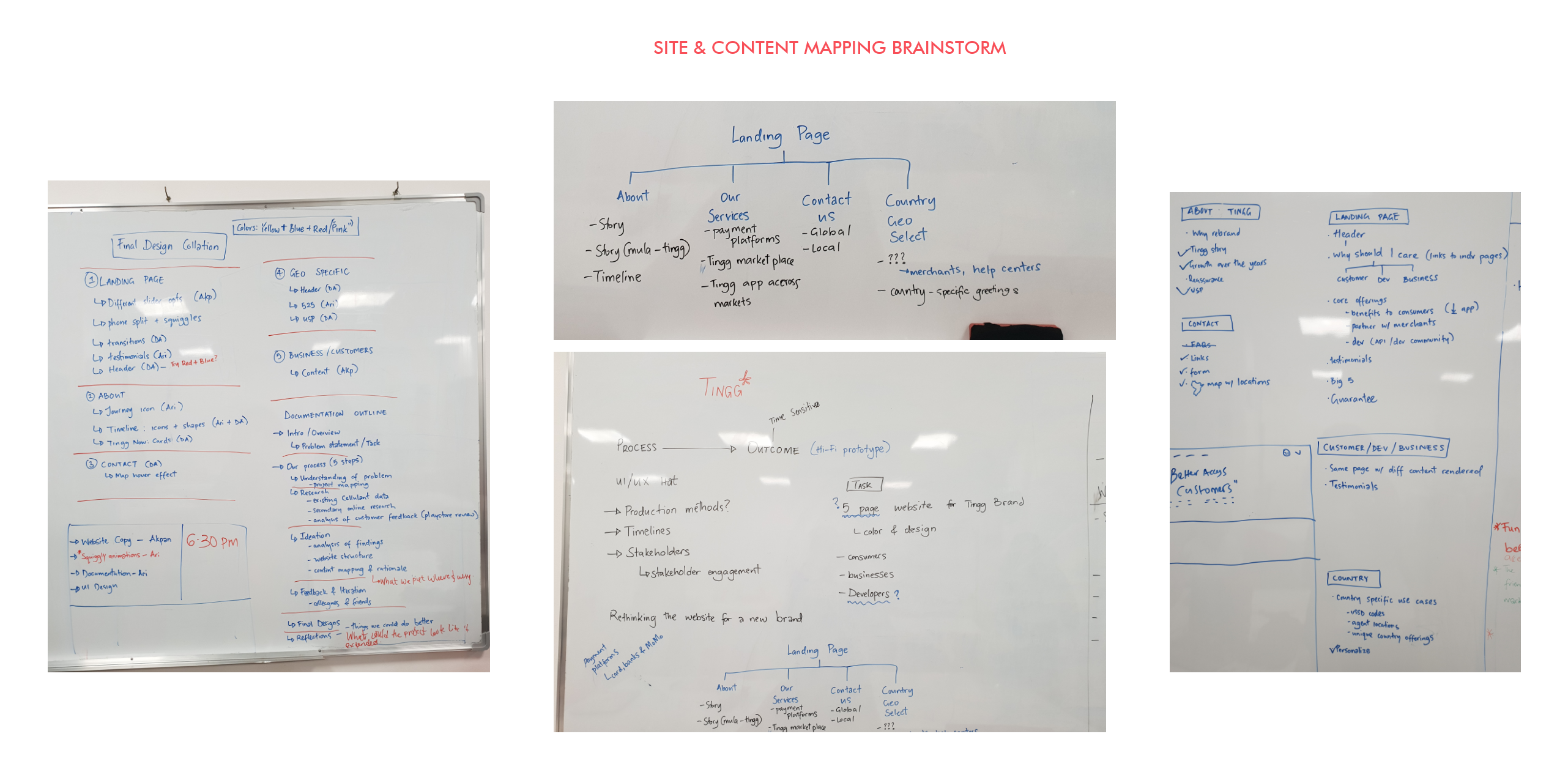
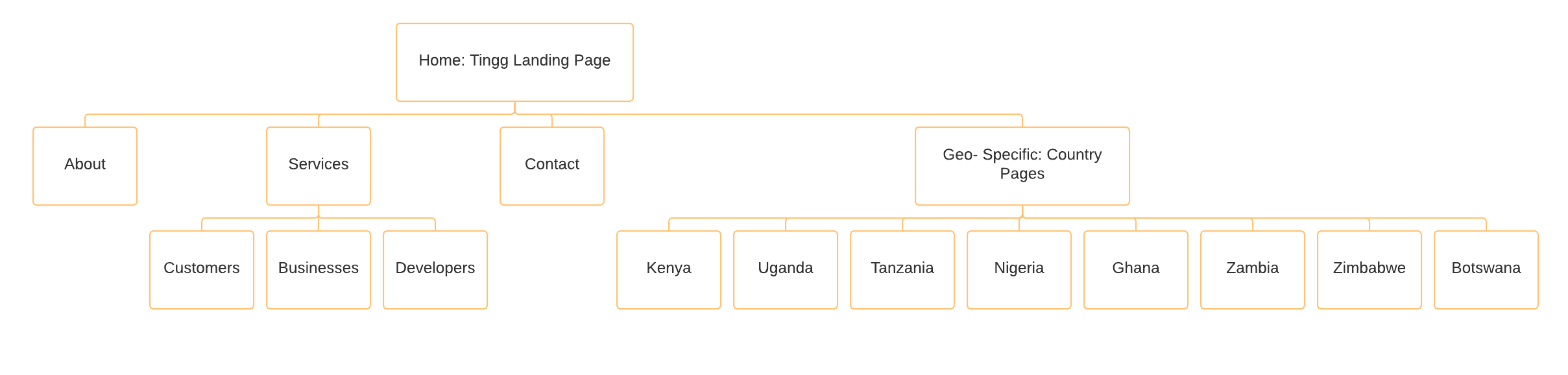
The next step was to finalize the site map that would be used to build the various pages.
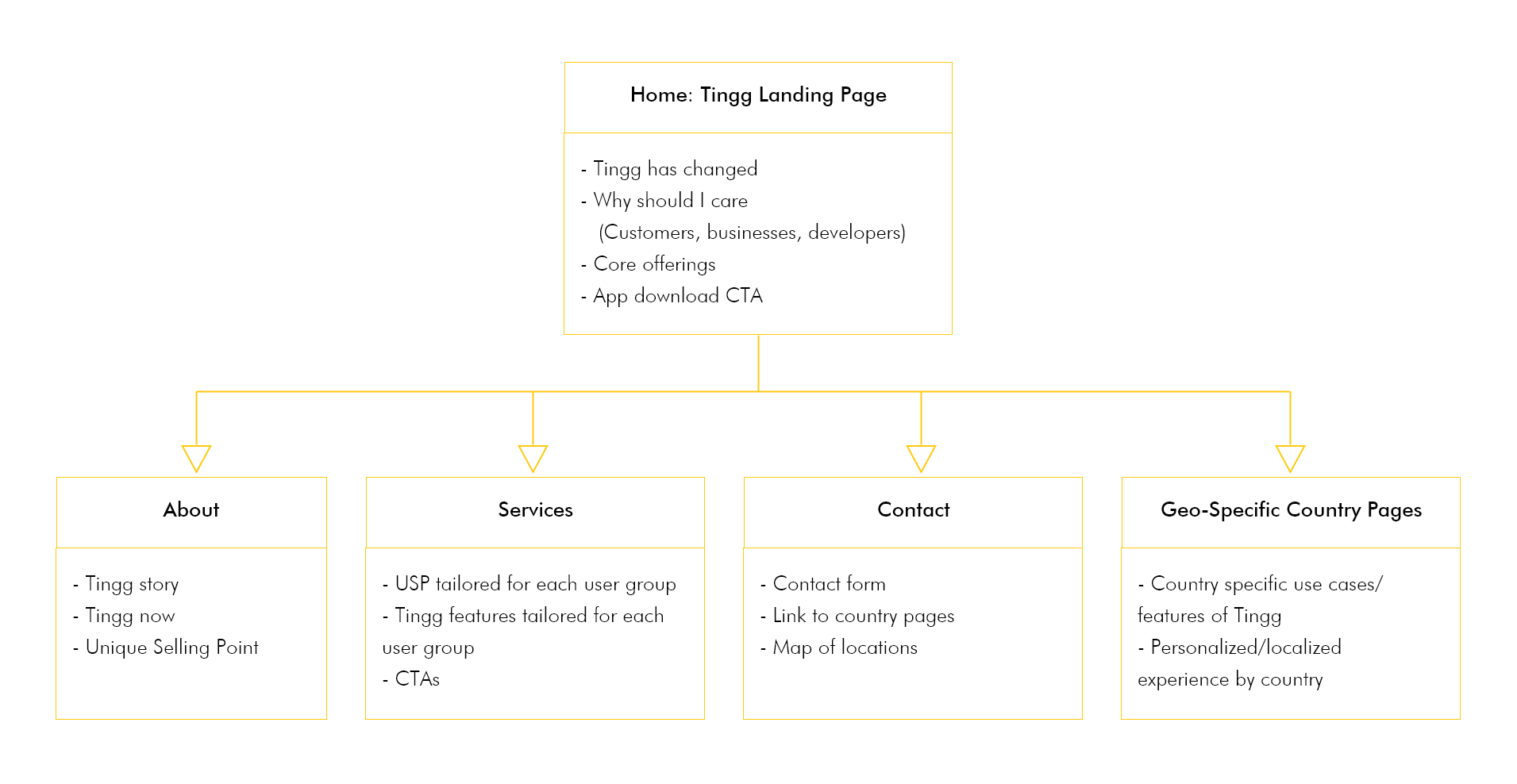
Following the creation of the structure design, the team proceeded to create mappings for the content for each one of those pages. The mappings are described in the diagram below.
The following are ways to improve on the design given a longer time frame: